

In today’s digital world, people access websites from many devices—smartphones, tablets, laptops, and desktops. Because of this, businesses must ensure their websites provide a smooth experience across all screen sizes. Two popular approaches used by web developers are responsive design and mobile-first design.
While both strategies aim to make websites accessible on different devices, they follow different development philosophies. Understanding these approaches is important for businesses that want to build fast, user-friendly, and SEO-friendly websites.
At KTPL – Business Growth Agency, website performance and user experience are always considered before selecting a design strategy. Choosing the right approach can directly influence engagement, conversions, and search rankings.
In this guide, we will explain responsive design and mobile-first design in simple terms, compare their advantages and limitations, and help you decide which one is best for your business website.
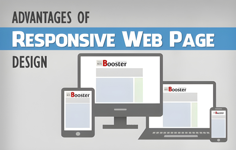
What is Responsive Web Design?
Responsive web design is a development approach where a website automatically adapts its layout, images, and content according to the screen size of the device being used.
Instead of building separate websites for mobile and desktop, responsive design uses flexible grids, fluid layouts, and CSS media queries to adjust the interface dynamically.
- On a desktop screen, the website may display multiple columns.
- On a tablet, the same content may appear in two columns.
- On a smartphone, the layout typically becomes a single vertical column.
Responsive design has become widely adopted because it allows businesses to maintain one website and one codebase instead of managing multiple versions.
Key Features of Responsive Web Design
Responsive websites rely on several technologies and design principles to work effectively.
1. Flexible Layouts
Responsive websites use fluid grids instead of fixed-width layouts. This allows the content to expand or shrink depending on screen size.
2. CSS Media Queries
Media queries detect the screen width and apply different styling rules for different devices.
3. Adaptive Images
Images automatically resize so that they look clear without slowing down the page.
4. Flexible Navigation
Navigation menus adjust based on screen size. On smaller screens, menus often convert into a hamburger icon.
These elements work together to ensure the website maintains usability across various devices.
Advantages of Responsive Design
Responsive design offers many benefits for businesses that want a flexible website structure.
Consistent User Experience
Users see the same website regardless of device, ensuring consistent branding and functionality.
Easier Content Management
Website owners only need to update content once, and changes appear on all devices automatically.
Better SEO Performance
Search engines prefer websites that provide the same content across devices rather than multiple versions.
Cost-Effective Development
Maintaining a single website is often more affordable than managing separate mobile and desktop versions.
Limitations of Responsive Design
Although responsive design is widely used, it does have some challenges.
Slower Loading on Mobile
Responsive websites sometimes load unnecessary elements designed for desktop devices, which can slow down mobile performance.
Complex Development
Developers must test the website across many screen sizes and devices, which can increase development time.
Design Compromises
Trying to serve all devices with one layout can sometimes lead to compromises in mobile usability.
For businesses where mobile users dominate traffic, another approach—mobile-first design—may be more effective.
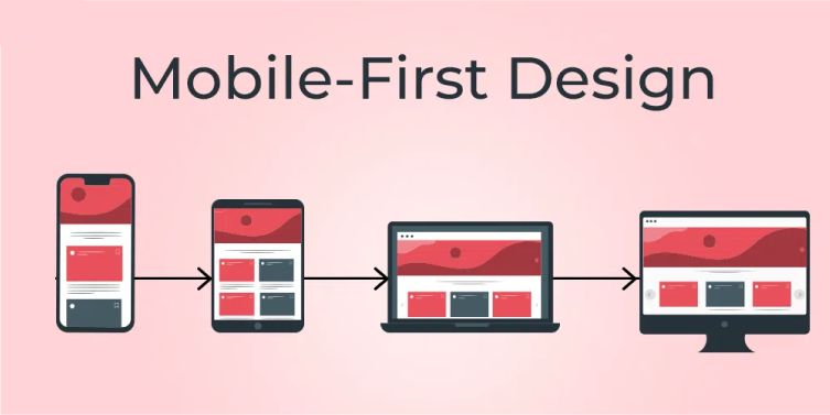
What is Mobile-First Design?
Mobile-first design is a development strategy where the website is designed first for smartphones, and then enhanced for larger screens such as tablets and desktops.
Instead of shrinking a desktop website to fit mobile devices, developers begin with the smallest screen and gradually add more features for larger displays.
This technique focuses on essential content and performance from the beginning, ensuring mobile users get a fast and efficient browsing experience.
Because a large percentage of internet traffic now comes from smartphones, many modern websites adopt the mobile-first approach.
Key Characteristics of Mobile-First Design
Mobile-first design emphasizes simplicity and performance.
Minimalistic Layout
Mobile screens have limited space, so designers prioritize essential content.
Touch-Friendly Elements
Buttons and navigation are designed for touch interaction rather than mouse clicks.
Faster Loading Speed
Mobile-first websites often load faster because they include only the most important elements.
Progressive Enhancement
Additional features are gradually added as screen size increases.
This approach ensures the core user experience remains strong even on small devices.
Advantages of Mobile-First Design
Mobile-first design provides several benefits, especially for modern digital audiences.
Improved Mobile Performance
Since the design starts with mobile users in mind, websites load faster and run smoothly on smartphones.
Better User Experience
Important content appears first, making it easier for visitors to navigate.
Higher SEO Potential
Search engines prioritize mobile usability, making mobile-optimized websites more competitive.
Focus on Essential Content
Designers must prioritize what truly matters, which often leads to cleaner and more effective interfaces.
Challenges of Mobile-First Design
While mobile-first design offers many advantages, it may not always be the best choice.
Limited Design Space
Small screens restrict the amount of content that can be displayed initially.
Desktop Experience May Need Extra Work
Designers must carefully enhance the layout for larger screens to ensure it doesn’t look too simple.
Development Planning Required
Developers need a clear content strategy before building the website to maintain consistency across devices.
Responsive vs Mobile-First Design: Key Differences
Understanding the difference between these approaches helps businesses choose the right strategy.
Feature | Responsive Design | Mobile-First Design |
Starting Point | Desktop layout first | Mobile layout first |
Design Strategy | Adapts downward to smaller screens | Builds upward to larger screens |
Performance | May load extra elements | Lightweight and faster |
User Focus | All devices equally | Mobile users prioritized |
Development Method | CSS adjustments | Progressive enhancement |
Both approaches aim to deliver a good user experience across devices, but the starting point and optimization strategy differ significantly.
When Should You Choose Responsive Design?
- Your website has complex layouts or large amounts of content
- Desktop users still represent a significant portion of your audience
- You want a balanced experience across all devices
- Your website already exists and needs mobile compatibility
When Should You Choose Mobile-First Design?
- Most visitors come from smartphones
- Website performance and speed are critical
- The project is a new website build
- The website focuses on simple interactions or conversions
Which Approach Is Better for Your Business?
The answer depends on your audience behavior and website goals.
If most of your visitors access the website through mobile devices, mobile-first design can provide a faster and more optimized experience.
However, if your audience uses multiple devices equally, responsive design may offer a more balanced solution.
At KTPL – Business Growth Agency, the decision usually begins with analyzing user data such as device usage, traffic patterns, and business objectives. By understanding these factors, businesses can choose the design strategy that supports growth and customer engagement.
Conclusion
Both responsive design and mobile-first design aim to create websites that work seamlessly across devices. However, they differ in their development philosophy and performance priorities.
Responsive design focuses on flexibility, adapting a desktop layout to different screen sizes. Mobile-first design starts with the smallest screen and expands upward, ensuring optimal performance for smartphone users.
As mobile internet usage continues to grow, many modern businesses are shifting toward mobile-first strategies. However, responsive design remains a reliable option for content-heavy and multi-device websites.
Ultimately, the best approach is the one that aligns with your audience, business goals, and long-term digital strategy.
FAQs
Have questions? We’ve answered some of the most common queries to help you understand the topic better
Q1. What is the main difference between responsive design and mobile-first design?
Responsive design starts with a desktop layout and adjusts it for smaller screens, while mobile-first design begins with mobile screens and expands for larger devices.
Q2. Is mobile-first design better for SEO?
Mobile-first websites often perform better in search results because they prioritize mobile usability and loading speed.
Q3. Can a website be both mobile-first and responsive?
Yes. Mobile-first websites are usually responsive because they adapt to larger screen sizes as well.
Q4. Which design approach is best for new websites?
Many modern developers recommend mobile-first design for new projects, especially if mobile traffic is high.
Q5. Do businesses still use responsive design today?
Yes. Responsive design remains widely used because it provides a flexible layout that works well across multiple devices.
Want To Grow Your Business - Connect With KTPL
KTPL – Business Growth Agency, a creative solutions and business growth agency from India.
👉 Visit https://kirnanitechnologies.com
📞 Call us at +91 95093 33000
📧 Email us at contact@kirnanitechnologies.com

