

Choosing the right colors for your brand is one of the most important decisions in building a strong visual identity. Colors influence how people feel about your business, how quickly they recognize it, and whether they trust it enough to buy from you. Many business owners search online for terms like right colors for brand, how to choose color for your brand, best color for my brand, brand color psychology, and how to create brand color palette. The demand for these topics continues to grow because color selection directly affects brand perception, engagement, and conversion rates.
This detailed guide explains everything in a clear and practical way so that business owners, startups, and growing brands can confidently select colors that align with their goals. This blog is curated by KTPL – Business Growth Agency for businesses looking to strengthen their brand identity, especially in competitive markets across India and global digital industries.
Why Brand Colors Matter in Modern Business
Brand colors are not decorative elements. They are strategic tools that influence emotions and behavior. Research in marketing psychology shows that color improves brand recognition significantly and helps customers remember a business faster.
When people think of certain brands, they immediately associate them with a color. For example, Coca-Cola is strongly connected with red, Facebook is known for blue, and Starbucks uses green to reflect freshness and sustainability. These companies maintain consistent color usage across websites, packaging, advertisements, and social platforms.
- Builds instant brand recognition
- Increases customer trust
- Strengthens emotional connection
- Improves marketing effectiveness
- Enhances professional perception
What People Search Before Choosing Brand Colors
- How to choose color for brand
- Best brand colors for small business
- Brand color psychology chart
- How many colors should a brand have
- Professional color combinations for branding
- Color palette ideas for business
Step One Define Your Brand Personality
Before selecting any color palette, it is essential to understand what your brand stands for. Colors should reflect personality, values, and positioning.
- Professional, reliable, trustworthy
- Creative, energetic, modern
- Luxury, premium, elegant
- Friendly, youthful, approachable
- Eco friendly, sustainable, natural
At KTPL – Business Growth Agency, brand strategy begins with defining clarity before designing visuals. Without clarity, color decisions become random and inconsistent.
Understanding Brand Color Psychology
Color psychology plays a major role in how customers perceive a business. Different colors trigger different emotional responses.
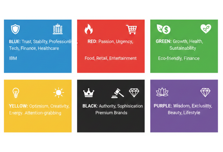
Blue is associated with trust, stability, and professionalism. It is widely used in technology, finance, and healthcare industries.
Red communicates passion, urgency, excitement, and power. It is often used in food, retail, and entertainment industries.
Green represents growth, health, sustainability, and nature. It works well for eco friendly brands and financial services.
Yellow expresses optimism, creativity, and energy. It attracts attention but should be used carefully to avoid overwhelming designs.
Black symbolizes luxury, authority, and sophistication. Premium brands frequently use black in combination with gold or white.
Purple represents luxury, wisdom, and exclusivity. It is commonly seen in beauty and premium lifestyle brands.
For example, IBM uses blue to communicate reliability and professionalism in enterprise technology.
Color meaning may also vary depending on culture and region. Businesses operating across India must consider regional interpretations when building a brand identity.
Know Your Target Audience
Understanding your audience is just as important as understanding your brand.
- Age group
- Gender preferences
- Cultural background
- Purchasing behavior
- Industry expectations
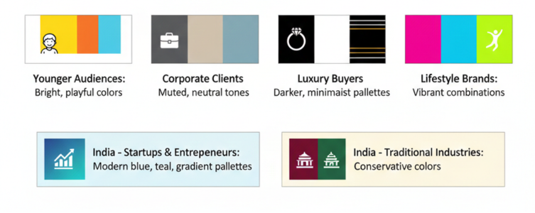
If your business targets startups and entrepreneurs in India, modern blue, teal, or gradient palettes may resonate well. If you serve traditional industries, conservative colors may perform better.
Research Competitors But Create Differentiation
Competitive analysis prevents duplication and helps identify opportunities for uniqueness.
- Common dominant colors in the industry
- Typography style
- Logo contrast
- Website design patterns
For example, many technology brands use blue, but they differentiate through shades, gradients, and accent colors.
Tools like Canva and Coolors can help test combinations before finalizing decisions.
The 60-30-10 Rule for Balanced Design
A professional brand palette usually follows a structured ratio known as the 60-30-10 rule.
- 60 percent primary color – Dominates website and branding
- 30 percent secondary color – Supports primary shade
- 10 percent accent color – Highlights call to action and important elements
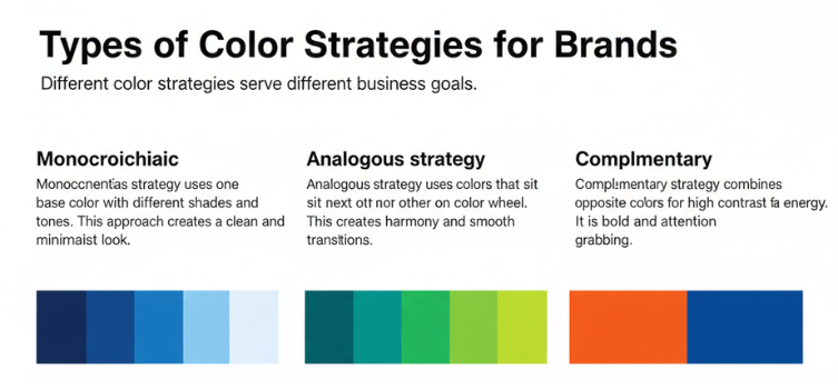
Types of Color Strategies for Brands
Different color strategies serve different business goals.
Monochromatic strategy uses one base color with different shades and tones. This approach creates a clean and minimalist look.
Analogous strategy uses colors that sit next to each other on the color wheel. This creates harmony and smooth transitions.
Complementary strategy combines opposite colors for high contrast and energy. It is bold and attention grabbing.
Professional design platforms like Looka provide automated suggestions based on these strategies.
Create a Mood Board Before Finalizing
A mood board allows visualization of the overall brand feel before final implementation.
- Sample website layouts
- Typography ideas
- Product packaging inspiration
- Textures and patterns
- Image references
- Color swatches
Test for Contrast and Accessibility
Good branding is not only attractive but also functional.
- Text readability on different backgrounds
- Button visibility
- Mobile responsiveness
- Print compatibility
- Accessibility standards
Document Brand Guidelines
Once colors are finalized, document everything clearly.
- HEX codes
- RGB values
- CMYK values
- Primary and secondary usage rules
- Background limitations
- Button and highlight instructions
Common Mistakes in Brand Color Selection
Many businesses make avoidable mistakes when choosing colors.
- Selecting colors based on personal preference instead of strategy
- Following short term design trends
- Using too many colors without structure
- Ignoring audience psychology
- Inconsistent application across platforms
Real Example Scenarios for Businesses in India
- Primary color – Deep blue
- Secondary color – Dark grey
- Accent color – Neon green
- Primary color – Black
- Secondary color – Gold
- Accent color – Beige
- Primary color – Forest green
- Secondary color – Earth brown
- Accent color – Soft yellow
How KTPL - Business Growth Agency Helps Businesses Choose the Right Brand Colors
KTPL – Business Growth Agency works with startups, SMEs, and growing brands across India to develop strong visual identities that align with business goals.
- Brand personality discovery sessions
- Competitor market research
- Audience psychology analysis
- Color palette creation using professional tools
- Website and social media consistency planning
- Brand guideline documentation
Final Thoughts on Choosing the Right Brand Colors
Choosing the right colors for your brand requires research, psychology, structure, and clarity. It is not about trends or personal taste. It is about strategic alignment.
When colors reflect personality, audience expectations, and industry positioning, they create a memorable identity that lasts for years.
If your business is planning a rebrand or launching a new venture in India, investing time in brand color strategy will significantly improve recognition and credibility.
FAQs
Have questions? We’ve answered some of the most common queries to help you understand the topic better
Q1. How to choose the right colors for brand
Start by defining your brand personality, understanding color psychology, researching competitors, and applying the 60-30-10 rule for balance.
Q2. What is the best color for my brand
There is no universal best color. The right choice depends on your industry, audience, and brand values.
Q3. How many colors should a brand use
Most professional brands use two to four core colors including primary, secondary, and accent shades.
Q4. Does brand color affect customer trust
Yes. Colors influence emotions and first impressions, which directly impact trust and buying decisions.
Q5. Should small businesses invest in brand color strategy
Absolutely. Strong color consistency increases recognition, improves credibility, and enhances marketing performance.
Want To Grow Your Business - Connect With KTPL
KTPL – Business Growth Agency, a creative solutions and business growth agency from India.
👉 Visit https://kirnanitechnologies.com
📞 Call us at +91 95093 33000
📧 Email us at contact@kirnanitechnologies.com

